

Clearly Gamer Glasses
Client: Luxottica/Essilor Brand: Clearly Project: Digital Experience Design Role: Creative Direction & UI designer Year: 2022
Client: Luxottica/Essilor
Brand: Clearly
Project: Online Experience
Role: Creative Direction & UI designer
Year: 2022
As gaming continues to grow in popularity across age groups and lifestyles, ergonomics, eye protection, and performance-enhancing accessories have become essential. Clearly, a brand under Luxottica, recognized a rising demand among gamers and frequent headset users for eyewear that supports long sessions without compromising fit or visual sharpness. The result was the Clearly Gamer collection: an affordable, exclusive line of glasses designed to meet the unique needs of the gaming community. With lightweight frames, headset compatibility, and prescription-ready lenses, this collection helps users play better, game longer, and protect their vision.
As gaming continues to grow in popularity across age groups and lifestyles, ergonomics, eye protection, and performance-enhancing accessories have become essential. Clearly, a brand under Luxottica, recognized a rising demand among gamers and frequent headset users for eyewear that supports long sessions without compromising fit or visual sharpness. The result was the Clearly Gamer collection: an affordable, exclusive line of glasses designed to meet the unique needs of the gaming community. With lightweight frames, headset compatibility, and prescription-ready lenses, this collection helps users play better, game longer, and protect their vision.
My role
My role
As the lead designer on this project, I was responsible for developing all key visuals to support the launch campaign of the Clearly Gamer collection across both digital and physical platforms. This included conceptualizing and directing a dedicated photoshoot to capture the essence of the product in use, ensuring visual consistency and relevance for the gaming audience. I also created supporting graphics used throughout the campaign, from landing pages and product detail pages to performance ads and marketing assets, all tailored to emphasize the collection’s core values of comfort, clarity, and performance.
As the lead designer on this project, I was responsible for developing all key visuals to support the launch campaign of the Clearly Gamer collection across both digital and physical platforms. This included conceptualizing and directing a dedicated photoshoot to capture the essence of the product in use, ensuring visual consistency and relevance for the gaming audience. I also created supporting graphics used throughout the campaign, from landing pages and product detail pages to performance ads and marketing assets, all tailored to emphasize the collection’s core values of comfort, clarity, and performance.
Challenges
Challenges
Creating a gamer-focused visual identity
Creating a gamer-focused visual identity
Capturing authentic, in-use product photography
Capturing authentic, in-use product photography
Balancing creativity with performance goals
Balancing creativity with performance goals
Ensuring consistency across all touchpoints
Ensuring consistency across all touchpoints

UX Design approach
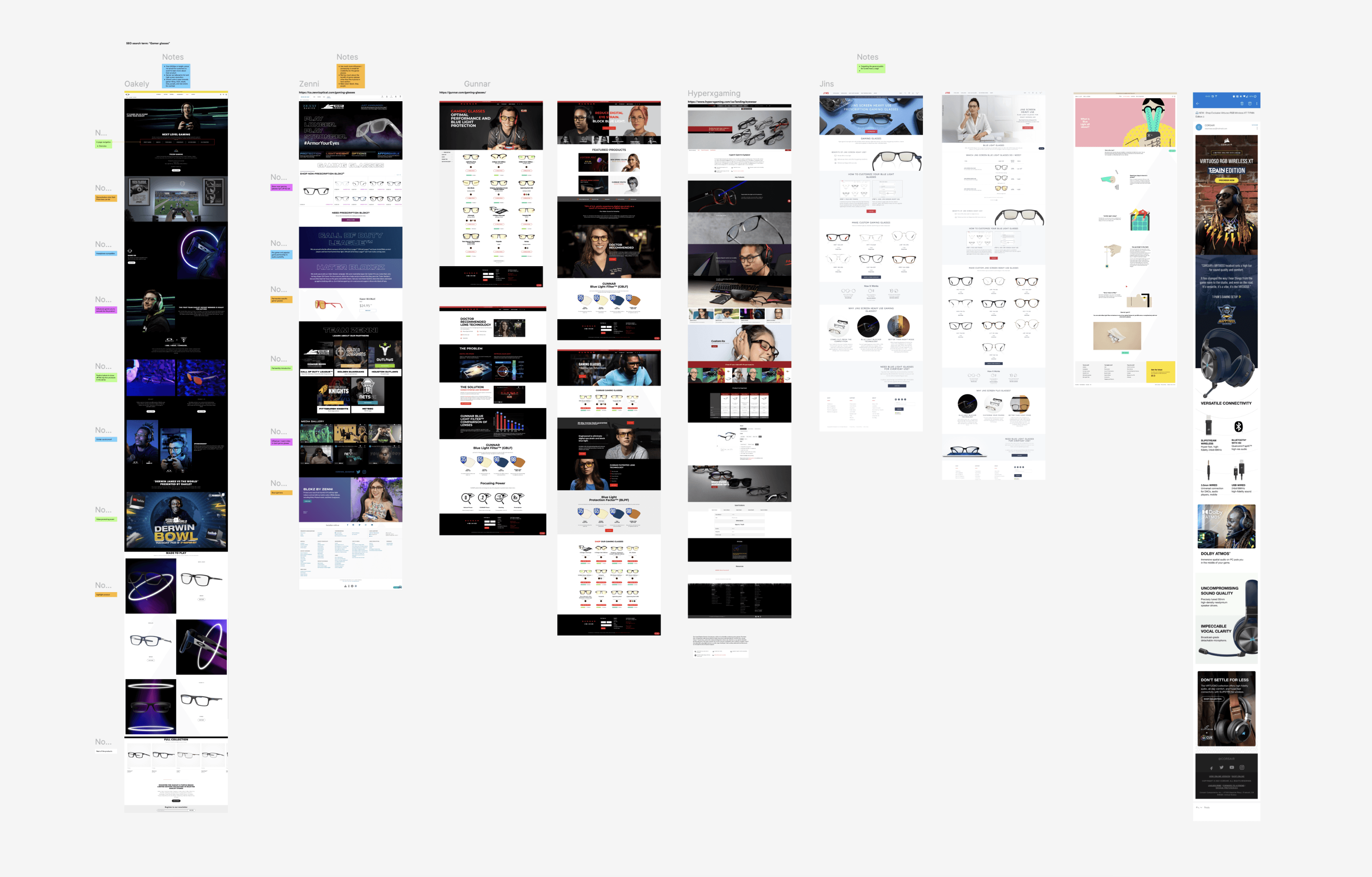
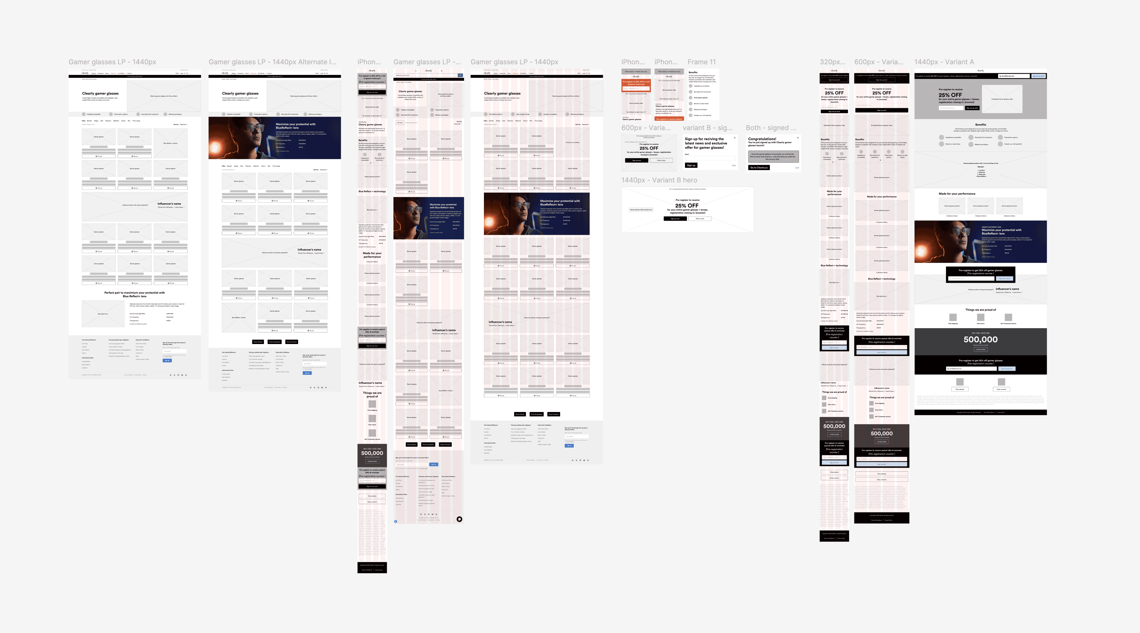
To ensure a seamless and engaging user experience, the web development process began with a user flow map (1) that outlined the journey from campaign entry points to product exploration and conversion. A clear structure was defined to prioritize product visibility, ease of navigation, and messaging tailored to the gaming audience. Competitive research (2) was also conducted to benchmark visual and functional standards across similar campaigns. These insights informed the wireframes (3), which were designed to balance performance goals with a clean, immersive interface.
To ensure a seamless and engaging user experience, the web development process began with a user flow map (1) that outlined the journey from campaign entry points to product exploration and conversion. A clear structure was defined to prioritize product visibility, ease of navigation, and messaging tailored to the gaming audience. Competitive research (2) was also conducted to benchmark visual and functional standards across similar campaigns. These insights informed the wireframes (3), which were designed to balance performance goals with a clean, immersive interface.
1 • User Flow Map

2 • Competitive research
3 • Wireframes
UI development
UI development
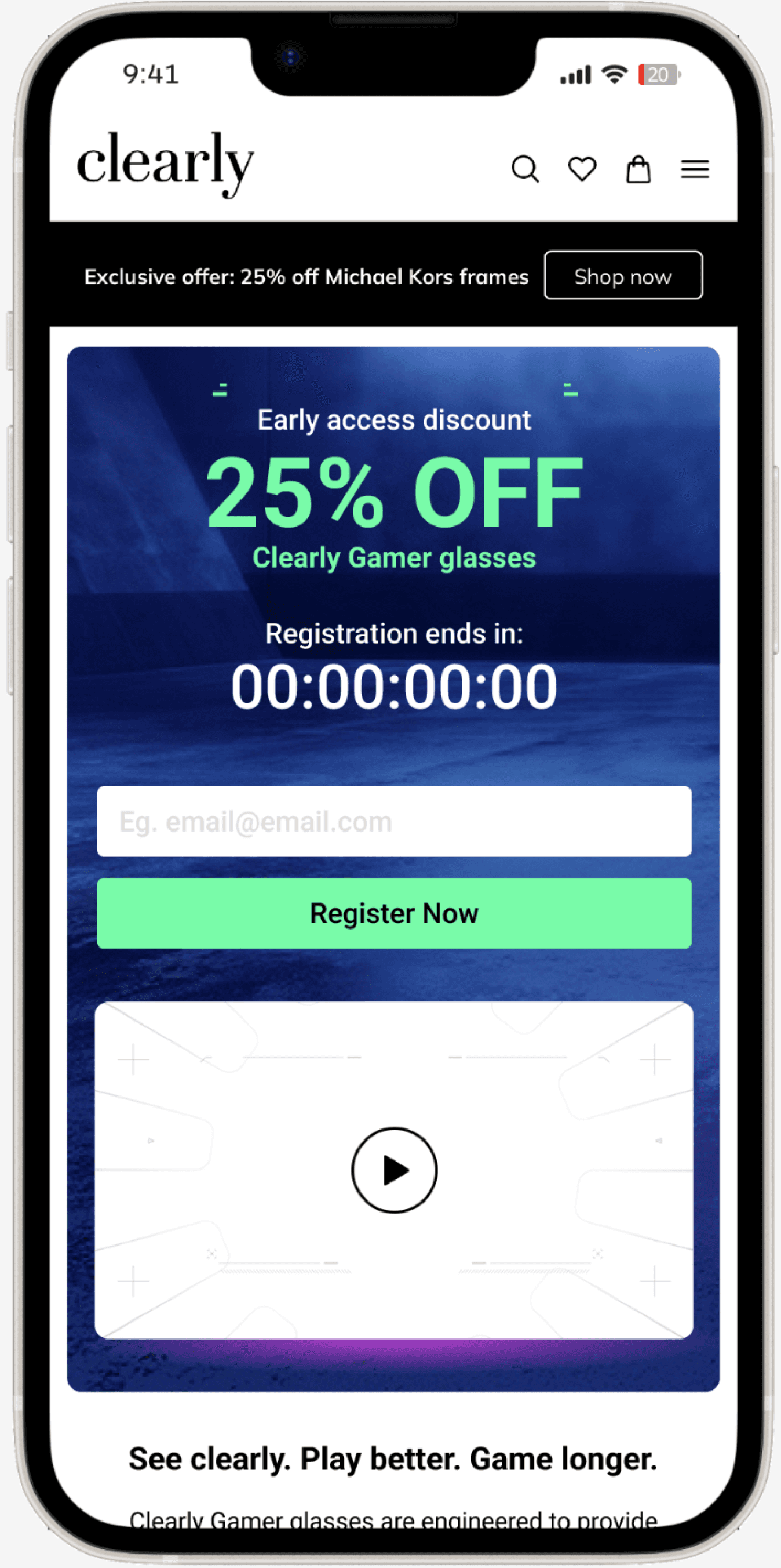
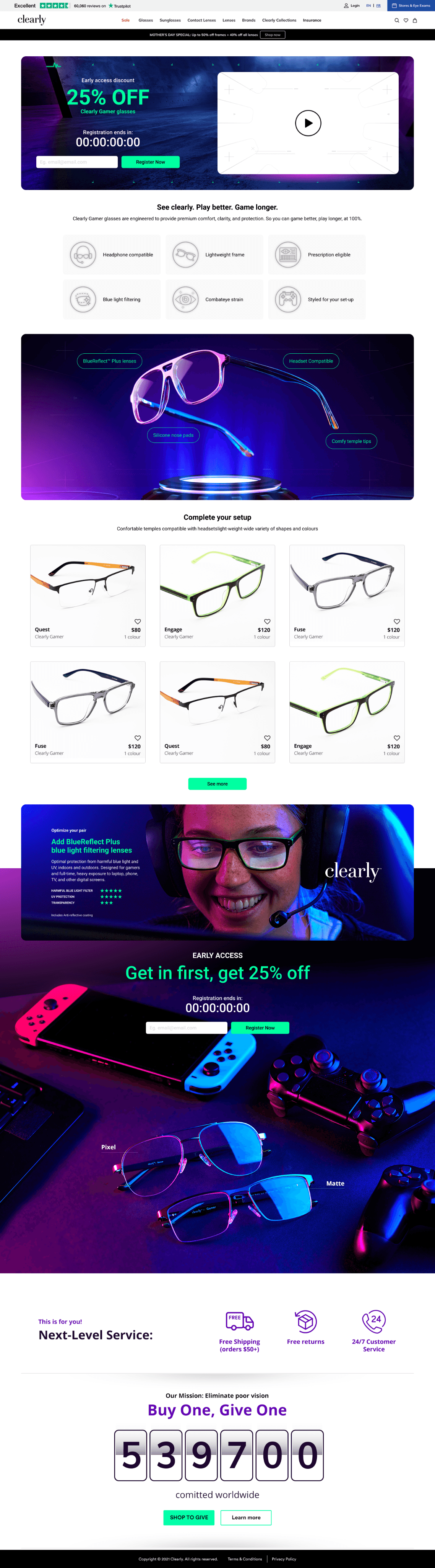
The experience was built with a mobile-first mindset to make sure everything felt intuitive, fast, and easy to navigate, no matter the device. From the landing page to the product details, the design focused on bold visuals, quick load times, and clear, benefit-driven messaging around features like headset compatibility and BlueReflect™ blue light filtering lenses. We also worked in early access sign-ups, email registration, Clearly’s core values, and their charity initiative to boost engagement and build trust with users across both mobile and desktop.
The experience was built with a mobile-first mindset to make sure everything felt intuitive, fast, and easy to navigate, no matter the device. From the landing page to the product details, the design focused on bold visuals, quick load times, and clear, benefit-driven messaging around features like headset compatibility and BlueReflect™ blue light filtering lenses. We also worked in early access sign-ups, email registration, Clearly’s core values, and their charity initiative to boost engagement and build trust with users across both mobile and desktop.


Creative Inputs
Creative Inputs
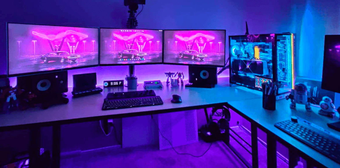
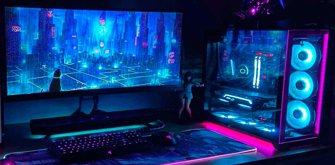
To align the visuals with the intended demographic, I directed a custom photoshoot featuring talent and product shots that reflected real gaming scenarios. The color palette was inspired by typical gamer setups, using dark tones and LED-style lighting to create an atmospheric, on-brand look. These creative assets were applied consistently across all media to reinforce the product’s connection to the gaming lifestyle.
To align the visuals with the intended demographic, I directed a custom photoshoot featuring talent and product shots that reflected real gaming scenarios. The color palette was inspired by typical gamer setups, using dark tones and LED-style lighting to create an atmospheric, on-brand look. These creative assets were applied consistently across all media to reinforce the product’s connection to the gaming lifestyle.


#2D0B55
Dark Purple
#5F0EBF
Vibrant Purple
#C231D2
Hot Pink
#69FFA8
Caribbean Green
#11329D
Dark Blue
#217BDF
Blue
74%
of traffic from the core gaming demographic (18–34)
48%
of early access signups were from new visitors
2.3x
higher click through rate on ads featuring BlueReflect™ lenses
Learnings
Learnings
This project reinforced the value of designing with a specific audience in mind. By tailoring both visuals and messaging to align with gamer behaviours and aesthetics, we were able to connect directly with the intended demographic. Every design decision, from photo direction to interface layout, was shaped by user needs, helping the campaign feel both relevant and engaging. It also highlighted how aligning brand values (like comfort, clarity, and impact) with the audience’s lifestyle leads to a more authentic experience, stronger engagement, and better performance across digital channels.
This project reinforced the value of designing with a specific audience in mind. By tailoring both visuals and messaging to align with gamer behaviours and aesthetics, we were able to connect directly with the intended demographic. Every design decision, from photo direction to interface layout, was shaped by user needs, helping the campaign feel both relevant and engaging. It also highlighted how aligning brand values (like comfort, clarity, and impact) with the audience’s lifestyle leads to a more authentic experience, stronger engagement, and better performance across digital channels.
Video created in partnership with ONE23WEST
Video created in partnership with ONE23WEST
See other projects


